APEX provides three types of pages till APEX 20.
To create these pages Select Page Mode.
- Page Mode
Select the page mode for this page.
Available options include:
- Normal
The page is presented as a normal Application Express application page. - Modal Dialog
The page is presented as a modal dialog. A modal dialog is an overlay window positioned within the viewport, which remains active and focused until the end user dismisses (closes) it. The underlying page is grayed out and the end user is prevented from interacting with the rest of the page until the dialog is closed. - Non-Modal Dialog
The page is presented as a non-modal dialog. A non-modal dialog is an overlay window positioned within the viewport, where the end user can interact with the dialog, and content on the page that launched the dialog. A non-modal dialog can be used when the requested information is not essential to continue, work can continue elsewhere while the window is still open.
Note that options Modal and Non-Modal Dialog will only be available for selection where the
current application theme contains a default Dialog Page Template.
- Page Template
Select a page template to define the appearance and layout of this page.
Page templates are defined in the application theme. When a page is created, the template is automatically set to Theme Default which will render the page using the default page template defined in the current theme. Making a selection here overrides the default page template.
Many themes contain page templates with specific purposes, such as for displaying content with side columns, login page, dialog pages, and so forth. Universal Theme provides the following page templates:
- Standard
The default page template. Ideal for home pages, dashboards, large reports, and other layouts where maximum screen real-estate is desired.
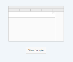
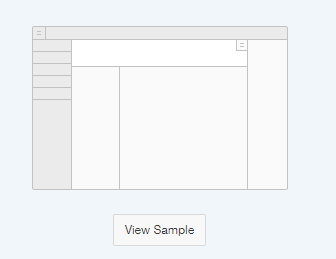
- Left Side Column
Provides a left display position that is useful for search and filter pages.
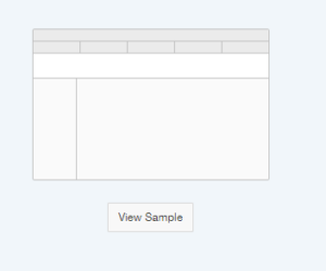
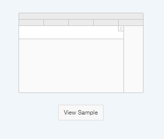
- Right Side Column
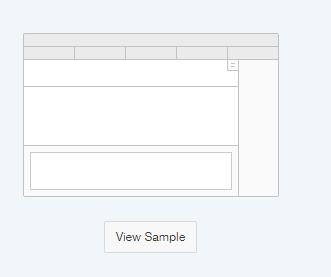
Provides a collapsible right-side display position that is useful for displaying action-oriented controls such as buttons or lists.
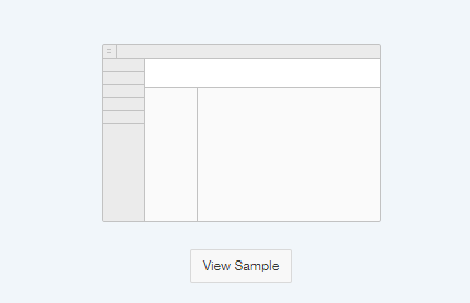
- Left and Right Side Columns
Provides both the left side column and collapsible right-side column that is well suited for very complex pages.
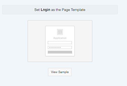
- Login
Used exclusively for the application login page.
- Marquee
Provides a collapsible right side column and a title-bar area which contains primary information. This page template is well suited for displaying a single record which has several related reports or data. Marquee is commonly used for displaying Master-Detail relationships where a single master record is first selected from a report.
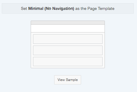
- Minimal (No Navigation)
Useful for very simple pages, disclaimers, single page applications, or where navigation is not necessary.
- Master Detail
This page template features a collapsible right side column and a title-bar area which contains primary information. This page template is well suited for displaying master-detail relationships.
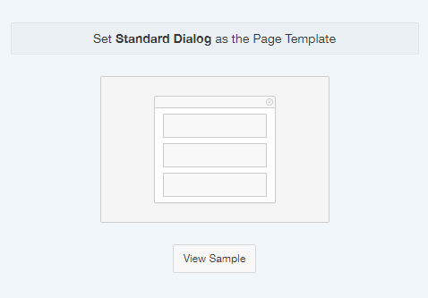
- Dialog
These page templates can be loaded as either modal or non-modal (pop-up) dialogs and are very useful for displaying commonly used forms, reports, and other components. Standard.
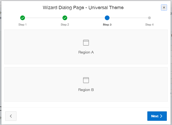
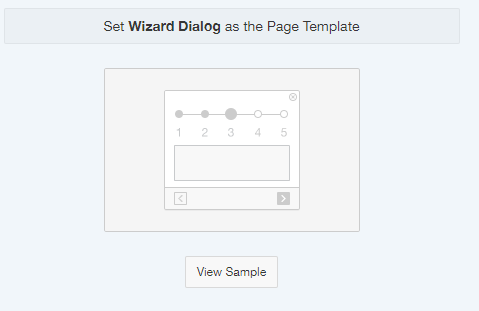
- Wizard Dialog