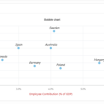
A combination chart, also known as a combo chart, is a type of chart that combines two or more chart types in a single visualization. This allows you to display multiple types of data in a single chart, making it easier to understand and compare different data sets.
For example, you might use a combination chart to display both a line chart and a bar chart in the same visualization. The line chart could show a trend over time, while the bar chart could show the actual values for each point in time. This allows you to see both the overall trend and the specific values at a glance.
To create a combination chart region in Oracle Apex, follow these steps:1. Sign in to Oracle Application Express by entering the credentials (Workspace, Username and Password).
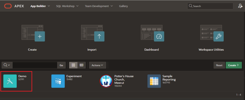
2. On the workspace home page, click the App Builder icon.
3. Click on your Application Name in which you want to create a New Page.
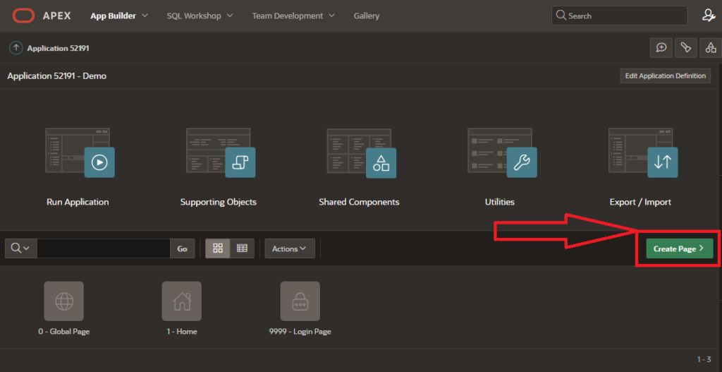
4. Click on “Create Page” button.
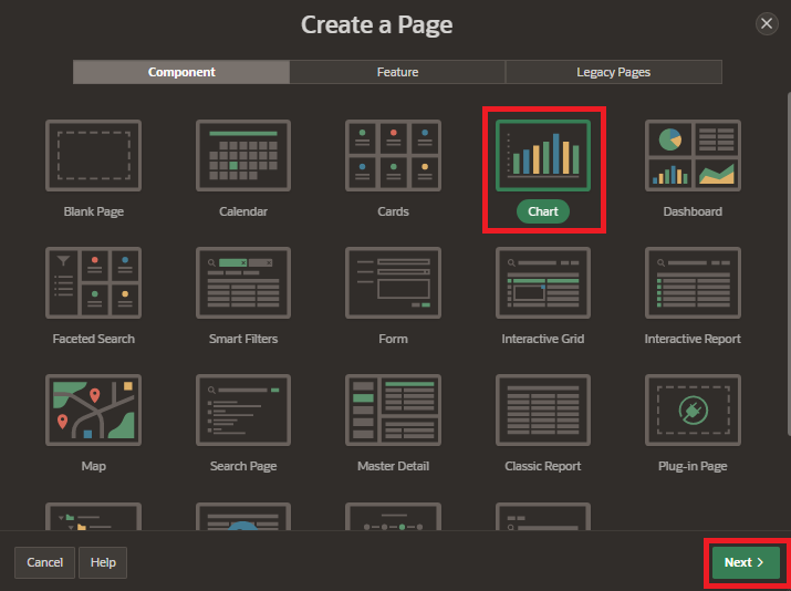
5. Select Component tab and Select a template for your page, or choose “Chart” if you don’t want to use a template.
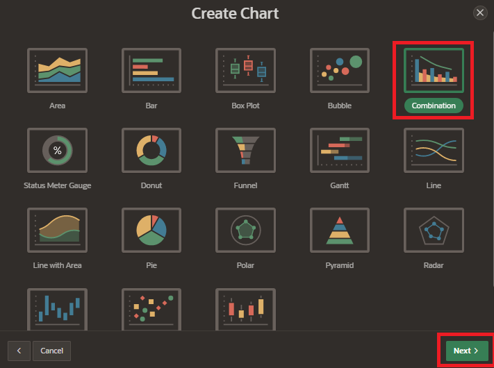
6. Select “Combination Chart” from the Chart Type list. There are several types of charts available, including area charts, bar charts, pie charts, and line charts etc. and click on “Next” button.
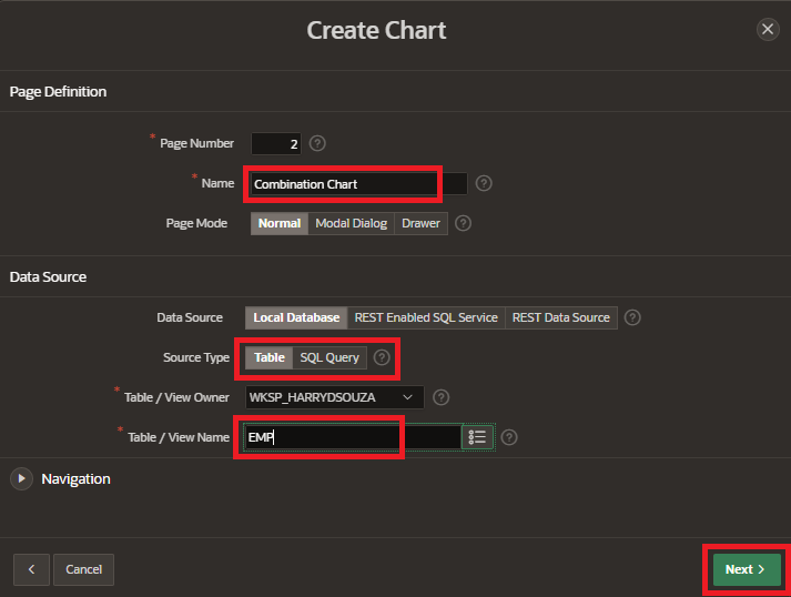
7. Enter page name and select the data source type for your report. This could be a table or view in your database, or a query you have created. and click on “Next” button.
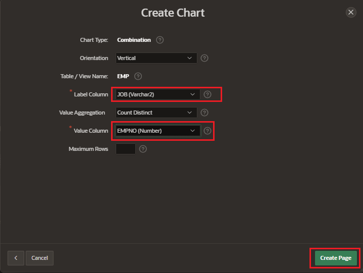
8. Select “Label Column” and “Value Column” and click on “Create Page”.
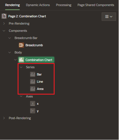
9. In the “Series” section, you can add multiple series to the chart by selecting the appropriate columns and series types.
10. Preview the chart to make sure it looks the way you want it to. Save the chart and click on Run page button.
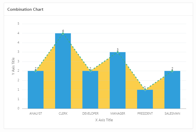
Note: The version of Oracle Apex and the steps may vary a bit based on the version you are using.
