In Oracle Apex, a chart region is a type of region that displays data in the form of a chart. A chart region allows you to visualize data from a database table or view or from a SQL query or PL/SQL function. You can use a chart region to display data in various chart types, such as bar charts, line charts, pie charts, and more.
- To create a chart region in Oracle APEX, you will need to specify the data source for the chart and select the type of chart you want to create. You can then customize the appearance of the chart and preview it to see how it looks. When you are satisfied with the chart, you can save your changes and the chart will be displayed on the page.
- Chart regions are useful for presenting data in a clear and visually appealing way. They can help users understand and analyze data more easily and can be used to highlight trends and patterns in the data.
In Oracle APEX, you can create a chart region by following these steps:- Go to the page you want to add the chart region to in the Page Designer.
- Click the “Create” button in the Region list on the right side of the page.
- In the “Region Type” field, select “Chart”.
- Enter a name for the chart region in the “Region Name” field.
- Click the “Create Region” button.
- In the chart properties, select the data source for the chart, and specify the chart type, X and Y axis, and other chart options.
- Click the “Apply Changes” button to save your changes and create the chart region.
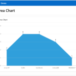
Below are the Chart Types available in Oracle APEX:- Area Chart: An area chart is a type of chart that displays data as a filled region between two data series. It is often used to show trends over time or to compare multiple series of data.
- Bar Chart: A bar chart is similar to a column chart, but the bars are horizontal rather than vertical. It is often used to compare different categories of data or to show changes over time.
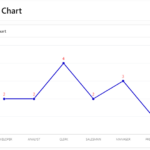
- Line Chart: A line chart is a type of chart that displays data as a series of data points connected by straight lines. It is often used to display trends over time or to compare multiple series of data.
- Pie Chart: A pie chart is a type of chart that displays data as a circular pie, with each slice representing a different category of data. It is often used to show proportions or percentages.
- Donut Chart: A donut chart is similar to a pie chart but with a hole in the center. It is often used to show proportions or percentages and can be used to compare multiple series of data.
- Scatter Plot: A scatter plot is a type of chart that displays data as a series of data points scattered across a coordinate plane. It is often used to show relationships between two sets of data.
- Bubble Chart: A bubble chart is a type of chart that displays data as a series of data points represented by circles (or bubbles). The size of the circles can represent a third dimension of data.
- Combination Chart: A combination chart, also known as a combo chart, is a type of chart that combines two or more chart types in a single visualization. This allows you to display multiple types of data in a single chart, making it easier to understand and compare different data sets.