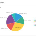
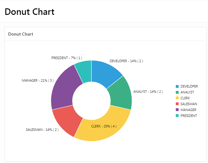
- A donut chart is a type of chart that is similar to a pie chart, but with a hole in the center. It is often used to show the proportion of data that falls into different categories.
- Donut charts can be useful for visualizing data when you want to show the relationships between multiple categories, but you don’t want to clutter the chart with too much information. They are also useful when you want to show the data in a more visually appealing way, as the hole in the center of the chart can make it more aesthetically pleasing.
- To create a donut chart, you need to have data that can be divided into categories. Each category will be represented by a slice of the donut chart. The size of the slice will be determined by the proportion of the data that falls into that category.
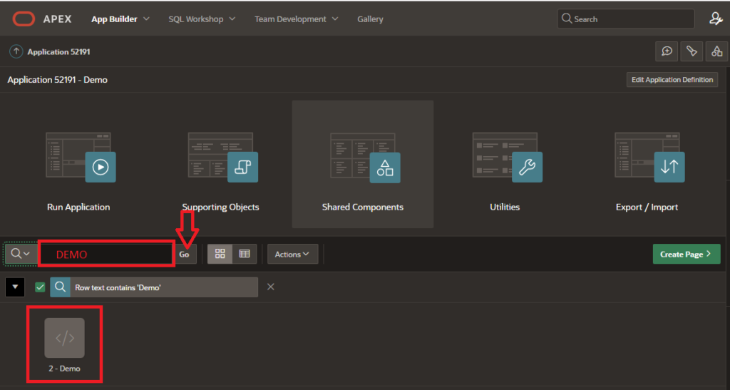
To create a Donut chart in Oracle Apex, follow these steps:- Open Oracle APEX and log in to your Workspace where you want to create the “Donut Chart Region”.
- Enter your Page Name (Demo) and search in which you want to create a “Donut Chart”.
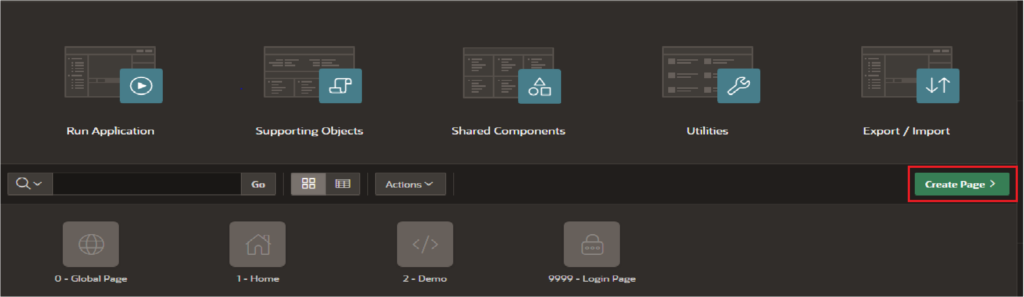
3. Click on the “Create Page” button in the top menu.
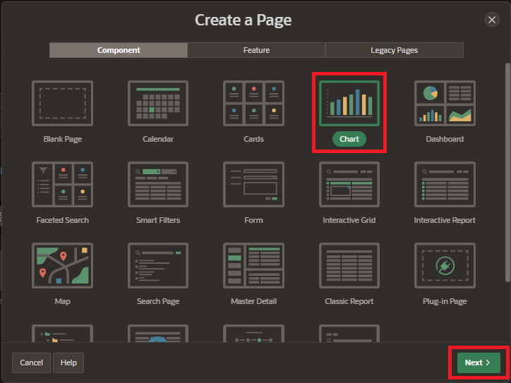
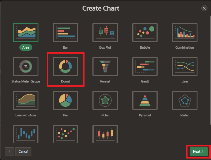
4. Select Component tab and choose the “Charts” option and click on “Next”.
5. Select “Donut Chart” from the Chart Type list. There are several types of charts available, including area charts, bar charts, pie charts, and line charts etc. and click on “Next” button.
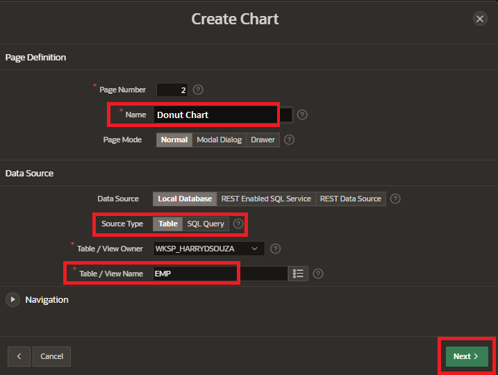
6. Enter page name and select the data source type for your report. This could be a table or view in your database, or a query you have created. and click on “Next” button.
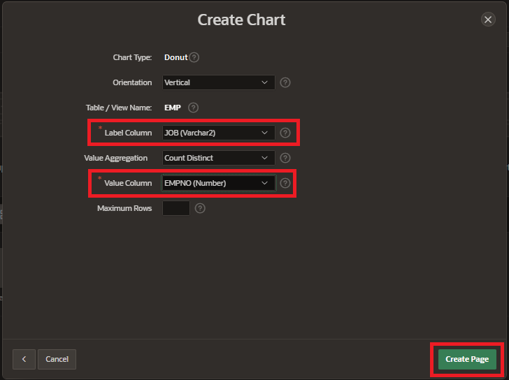
7. Select “Label Column” and “Value Column” and click on “Create Page”.
8. Customize the appearance of the chart by clicking the “Appearance” tab. You can specify the colors, fonts, and other visual properties of the chart in this section.
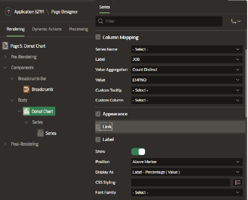
9. Preview the chart to make sure it looks the way you want it to. Save the chart and click on Run page button.
That’s it! You have now created a donut chart in Oracle Apex. You can further customize the chart by adding interactive features such as hover-over text, linking to other pages, and adding drill-down functionality.