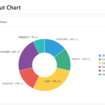
A pie chart is a circular statistical graphic, which is divided into slices to illustrate numerical proportion. In a pie chart, the arc length of each slice is proportional to the quantity it represents. Pie charts are very useful for displaying data for a part-to-whole relationship, such as showing the percentage of males and females in a population. They are also useful for showing data for a few categories, as long as the categories are not too numerous.
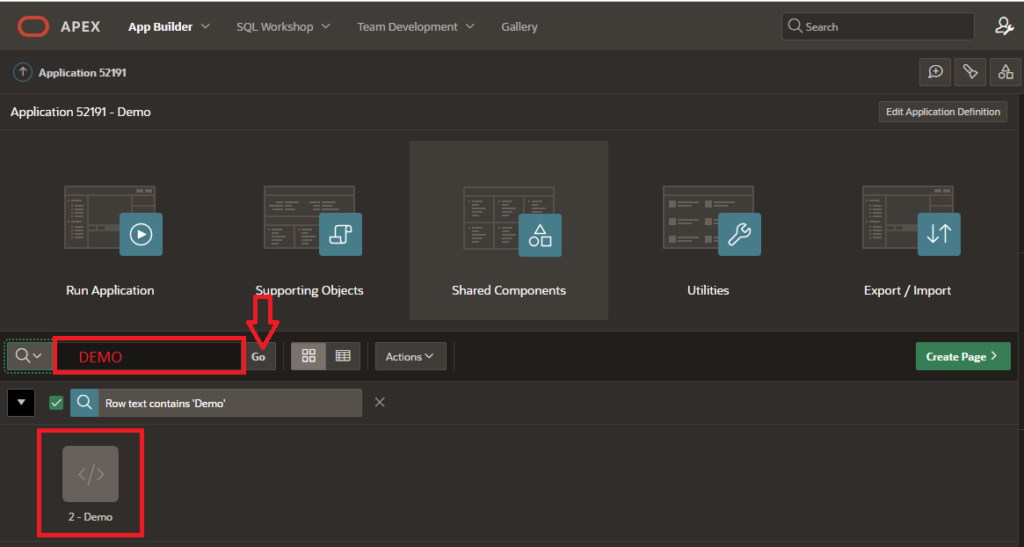
To create a Pie Chart in Oracle APEX, you can follow these steps:- Open Oracle APEX and log in to your Workspace where you want to create the “Pie Chart Region”.
- Enter your Page Name (Demo) and search in which you want to create a “Pie Chart”.
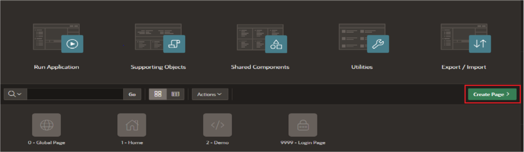
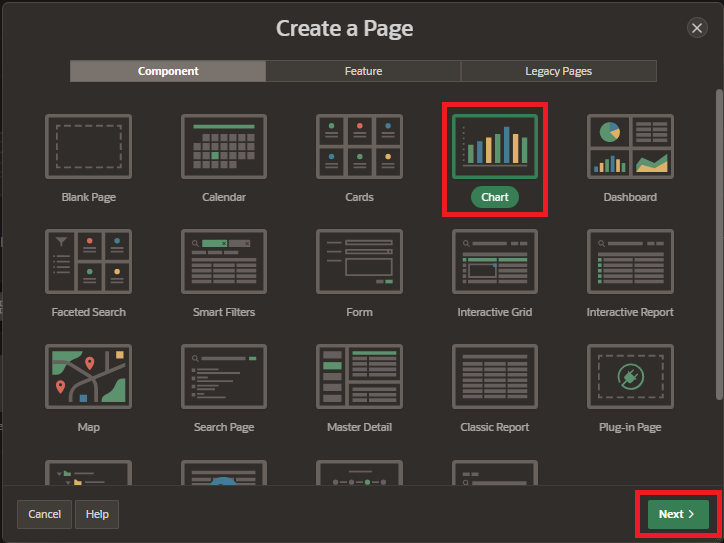
3. Click on the “Create Page” button in the top menu.
4. Select Component tab and choose the “Charts” option and click on “Next”.
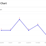
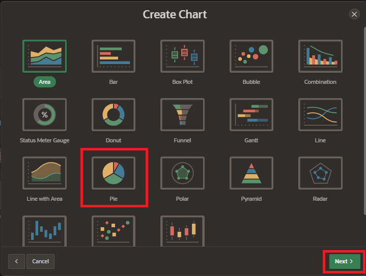
5. Select “Pie Chart” from the Chart Type list. There are several types of charts available, including area charts, bar charts, pie charts, and line charts etc. and click on “Next” button.
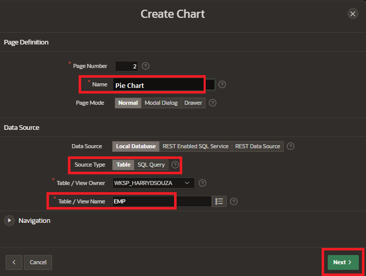
6. Enter page name and select the data source type for your report. This could be a table or view in your database, or a query you have created. and click on “Next” button.
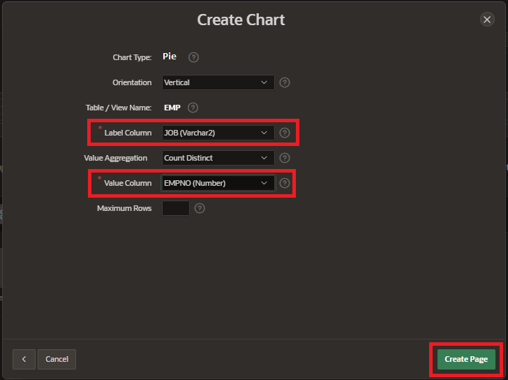
7. Select “Label Column” and “Value Column” and click on “Create Page”.
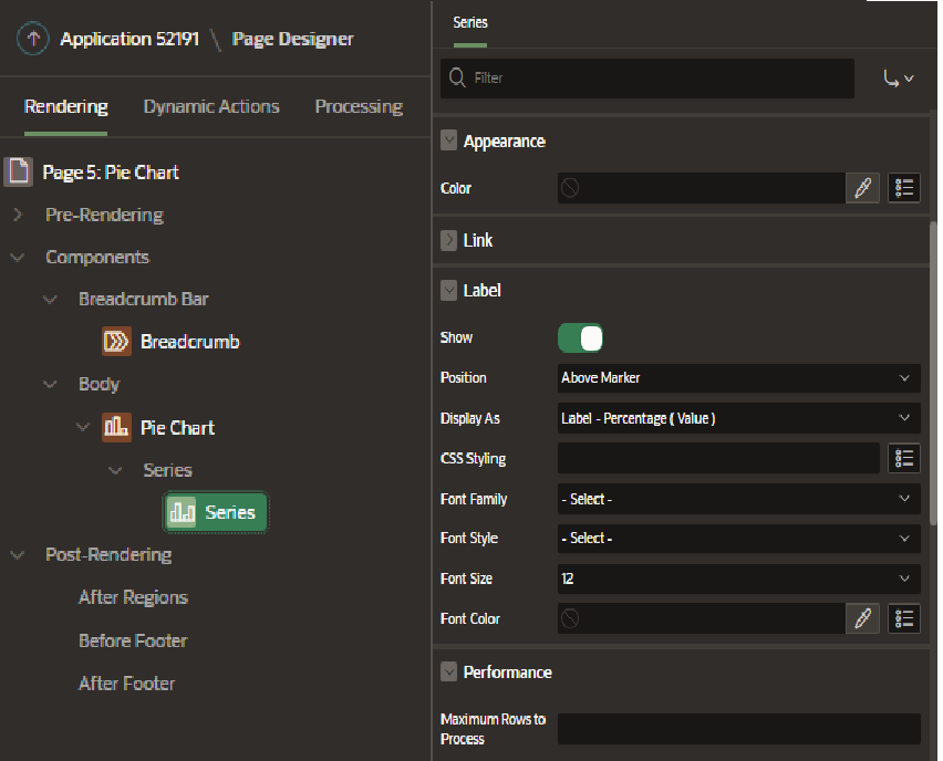
8. Customize the appearance of the chart by clicking the “Appearance” tab. You can specify the colors, fonts, and other visual properties of the chart in this section.
9. Preview the chart to make sure it looks the way you want it to. Save the chart and click on Run page button.
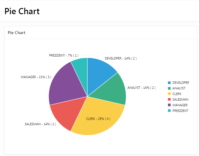
That’s it! You should now have a pie chart on your Oracle APEX page.