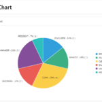
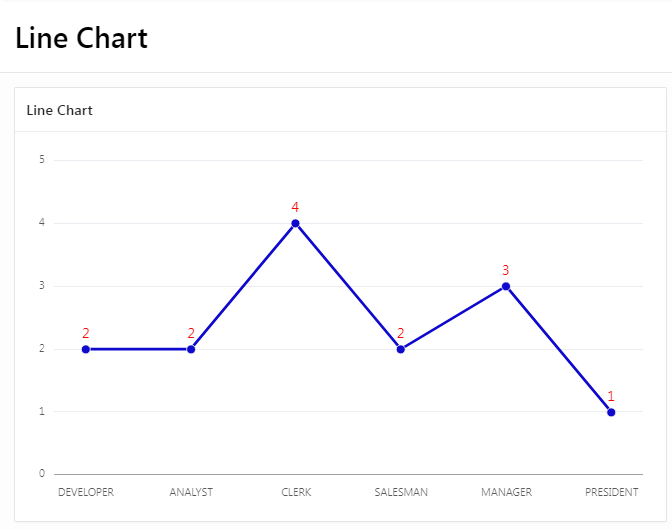
A line chart is a graphical representation of data that changes over time. It is useful for showing trends and patterns in data over a period of time. In a line chart, data points are plotted on a grid and connected by straight lines. The x-axis of a line chart typically represents time, while the y-axis represents the values of the data being plotted. Line charts can have multiple data series, each represented by a different line on the chart. Line charts are commonly used in business, finance, and scientific research to visualize data and understand trends.
Here is a step-by-step guide on how to create a line chart in Oracle Apex:- Open Oracle APEX and log in to your Workspace where you want to create the “Line Chart Region”.
- Enter your Page Name (Demo) and search in which you want to create a “Line Chart”.
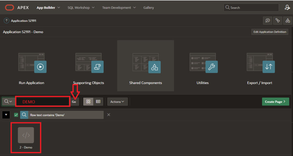
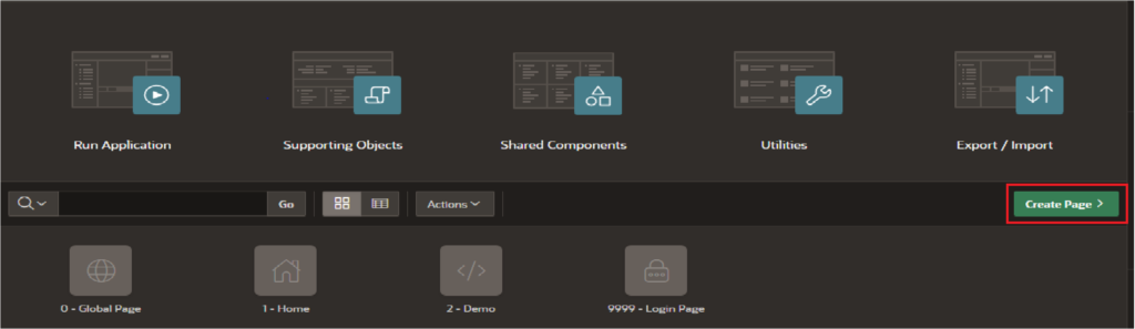
3. Click on the “Create Page” button in the top menu.
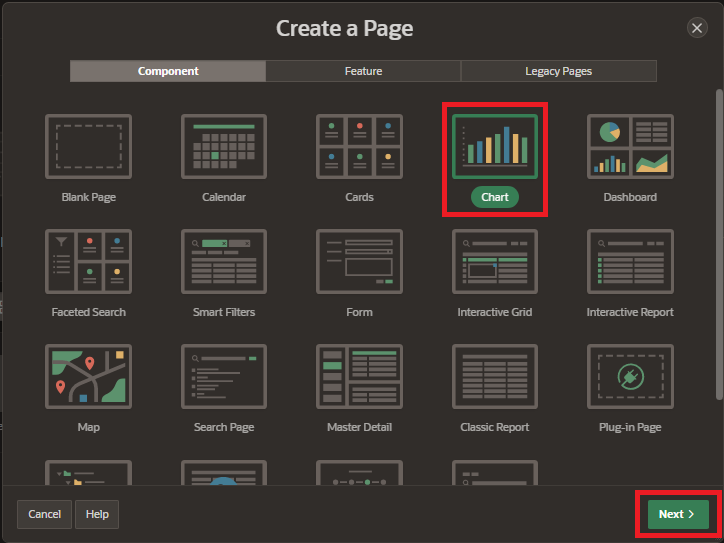
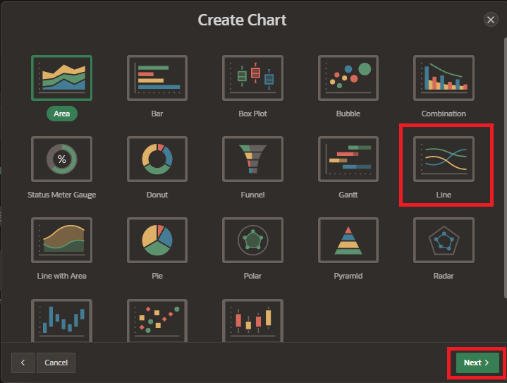
4. Select Component tab and choose the “Charts” option and click on “Next”.
5. Select “Line Chart” from the Chart Type list. There are several types of charts available, including area charts, bar charts, pie charts, and line charts etc. and click on “Next” button.
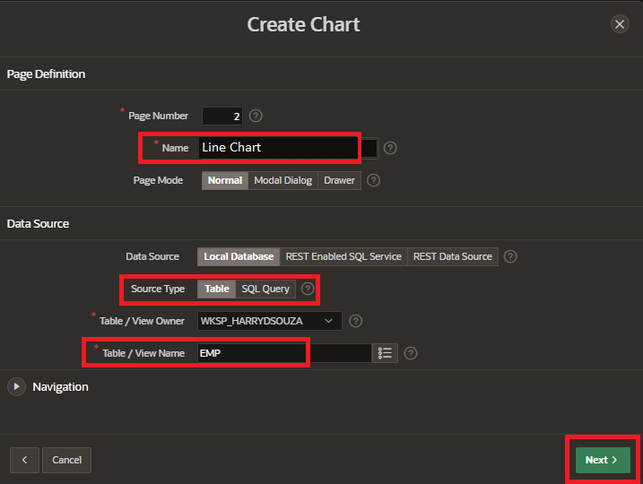
6. Enter page name and select the data source type for your report. This could be a table or view in your database, or a query you have created. and click on “Next” button.
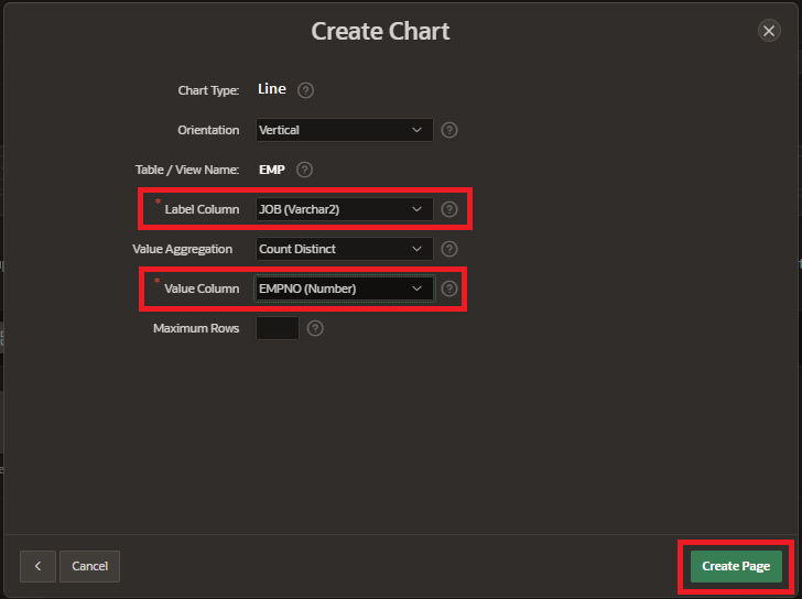
7. Select “Label Column” and “Value Column” and click on “Create Page”.
8. Define the chart attributes, such as the x-axis and y-axis, data series, and legend. and customize the appearance of your chart by choosing a color scheme and modifying other chart properties.
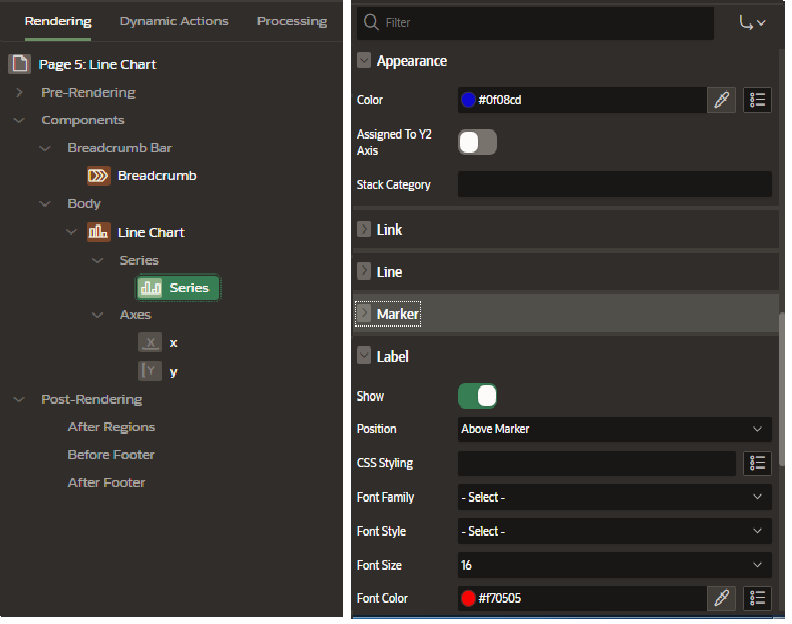
9. Preview the chart to make sure it looks the way you want it to. Save the chart and click on Run page button.
Preview your chart to see how it will look and make any necessary adjustments.